Production Pro Theme for OBS Studio
This theme is designed for people who need to broadcast live events with a simple compact design and adapted to the most essential plugins.
It is still a work in progress, it needs to be more polished but it is fully functional.

Since OBS Studio v30.2, now can choose between 3 styles: Original, Flat and Yami.

Flat Dark (flat buttons):

Yami Colors:

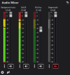
Example of a plugin adaptation:

Conventional t-bar and sliders (WIP):

Removed the exit button in the controls dock, preventing accidental shutdowns:

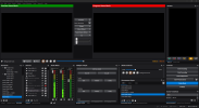
Example for a conventional stream with the Twitch chat:

I highly recommend the @Exeldro plugins that appear in these screenshots:
 obsproject.com
 obsproject.com
 obsproject.com
 obsproject.com
 obsproject.com
How to install
1. Unpack files into your OBS Studio Theme Folder (...\obs-studio\data\obs-studio\themes)
2. Go to Settings > General and select the theme
3. Restart OBS Studio to display it correctly
This theme is designed for people who need to broadcast live events with a simple compact design and adapted to the most essential plugins.
It is still a work in progress, it needs to be more polished but it is fully functional.
Since OBS Studio v30.2, now can choose between 3 styles: Original, Flat and Yami.
Flat Dark (flat buttons):
Yami Colors:
Example of a plugin adaptation:
Conventional t-bar and sliders (WIP):
Removed the exit button in the controls dock, preventing accidental shutdowns:
Example for a conventional stream with the Twitch chat:
I highly recommend the @Exeldro plugins that appear in these screenshots:
Source Dock
Plugin for OBS Studio allowing you to create a Dock for a source, which lets you interact, see audio levels, change volume and control media. Add and remove docks via menu Tools > Source Dock Thanks to the contribution of EF Education First
Move
If you're using OBS version 27, you need to download version 2.6.1 or lower. Download Plugin for OBS Studio to move sources to a new position during scene transition If the 2 scenes contain a source with similar name (configured with settings)...
Audio Monitor
Plugin for OBS Studio to add Audio Monitor dock and filter. It allows you to put the audio of a OBS source to an audio device by adding the Audio Monitor filter on the Source in OBS Studio. This can be useful in different use cases...
Media Controls
Download Add Media Controls Dock to OBS Installation Copy and merge the folders that are in the download zip to the OBS folder for example: C:\Program Files\obs-studio\ or C:\Program Files (x86)\obs-studio\ Start OBS Studio Donations You...
Scene Notes Dock
Plugin for OBS Studio allowing you to create a Dock for showing and editing notes for the current active scene. Thanks to the contributions of EF Education First
How to install
1. Unpack files into your OBS Studio Theme Folder (...\obs-studio\data\obs-studio\themes)
2. Go to Settings > General and select the theme
3. Restart OBS Studio to display it correctly