Add Source Tabs

skocks

New Member
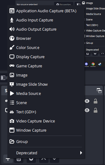
I conducted a cognitive walkthrough in order to see if a new user could accomplish a simple task that the software was made to accomplish. Through this cognitive walkthrough, I gained valuable insight on the UI of OBS and thought that there could be some improvements. Specifically in the create a new source window. In OBS you can choose to create a new source in which the software captures. Options include, your webcam, your screen, a specific application and many more. When my girlfriend Asia was going through the cognitive walkthrough, she tried to accomplish this task and was overwhelmed by the amount of information and options that popped up after clicking one button. I would like to suggest there be a page option, or advanced tab where users could choose which options they see when they click on the add source button in the UI
pbaL6i88NDjGwIIvy_dk0tTpZgqTJxAG9HjKYXTD5K3DQL7EOsDpiE712xU1OV_4tWOjBNyOvtdVMdG1mUlOuEsHAbuaONk_laCp_88XutgxDHeptepfyMUpX0UdYl2ey_TMADlUhEgWKvgrVFvwMLM
 

AaronD

Active Member
I certainly see your point, but then we also have people (usually in the Windows-specific forum) that panic when they can't find something that someone else mentioned, after just the one click.

I like the idea of organizing that list, but I think a better way to do it is to have a multi-level pop-out, kinda like the "Deprecated" entry in your screenshot. Have another one of those for "Capture", with all of the capture sources in there, another one for "Local File" or something like that, etc. Don't ever hide anything completely, and require an Advanced setting to get it back.

Even so, I'm personally a fan of the single big flat list. I also prefer analog audio rigs to digital, because the analog console's "sea of knobs" shows me everything at once and lets me adjust several unrelated things at the same time, compared to the countless menus and pages that a digital one has.
 
Top