this is huge but theres a few problems I have with it hope this helps you with development
You should make it more compact or as identical to the original one as possible, I think people that use this would prefer that, you probably just need to lower the label sizes, less padding inside the kebab menu button and less padding around the entire tracks
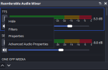
View attachment 118183
as you can see there, sources such as browser sources and window captures with capture audio deselected are displaying in the menu, although you can hide them you should have them hidden automatically
you should see if there is a way it can use the same colors the user sets in obs through settings -> accessibility, it would help
you should add the little settings button that is there on the bottom of the original audio mixer next to the two arrows you set
definetely move the decibels above the meters on the right instead of straight to the right of the meters on the horizontal layout, because when you for example go from 0db to a negative value, the meter changes in size because it needs to make room for the label and it just doesnt look as good imo
when selecting an audio track (basically talking about the blue outline you set when selecting one), you should fix the outline causing everything to get moved, by adding space for the outline for each track even if theyre not selected so its seamless and doesnt reposition everything.
for some reason some names grow in size compared to others randomly, I dont think this was intended and the size resets back to the size i assume you set when selecting that track.
now for features since you have tools to do these I think this would make your plugin get widespread adoption at least throughout this community and I would love it
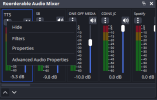
you should add a dropdown menu next to the arrows (edit: or add it to the right click dropdown menu) so you can display custom features like displaying the audio tracks to the right of each track in the mixer, these:
View attachment 118184
I dislike having to open the settings menu every time for this and it would be very helpful
you should add a compact mode checkbox in the dropdown to switch between the layout you have now and a more compact view with little to no padding
this may be amibitious but adding a feature where when double clicking the name of an audio track, it becomes an editable label that you can type in the new name, which then changes the name of the source in the sources list as well.
finally, for growth reasons you should create a installer for the plugin to provide both the option to drag the files in or use the installer, I use inno setup for installers but ultimately up to you
so thats all I could think of but man you got a good idea on your hands and would love to see this grow brotha