If using two green screens in live preview, do the colours need to match perfectly?

Hi peeps,

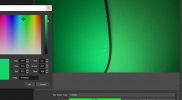
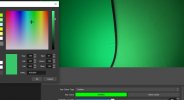
I am such a newbie it's shameful. Please tell me, let's say you're wearing green clothing in front of a green screen for certain effects, does the shade or hue of green need to match exactly? I have a 1.5m popup screen that matches a bodysuit perfectly, but I needed a larger screen, so I went for a 2 meter one (I could not get the same brand unfortunately). It arrived today, but it's a slightly lighter shade which is not what I wanted. Now, my camera through OBS makes them look the same when lighting is applied, and they key-out pretty much at the same time side-by-side with chromakey, so does that mean the slight difference in colour (and it really is only slight) does not matter, or will I regret keeping it months down the line when I learn the colour difference is holding me back in some way? I could keep trying different brands until I get a perfect match. I see different variations of green being used in professional studios, but this is different as there is no editing.

I am a newbie and want to learn, and I simply want to use OBS for its live preview functionality.

Sorry if I made a mess of this post and hope you can understand and help.

Thankyou!
 
When I used the colour-picker in OBS on the new green screen, the red values are higher by about 20 and saturation higher by about 40, even though it looks the same on the TV.

I am new to this, and would like to try and get a perfect key in the near future. It's a shame all the screens are not strictly kept to the exact same colour. The cloth is also slightly thicker and more reflective. Yes, the effect works, but as I start increasing similarity, it keys out just slightly after the other screen. It's a shame there is any red at all. Is it futile trying to get a perfect colour match?
 
Oh wow, no editing on this forum?? I need to correct:

"the red values are higher by about 20 and saturation lower by about 40"

Thanks
 

Kraezy

Member
Oh wow, no editing on this forum?? I need to correct:

obscropedit.png
 

koala

Active Member
You need some minimum amount of posts or account age (I don't know exactly) to be able to edit posts, probably the more posts, the longer the edit timeout.

If it comes to the slight color difference, I think that's what the Similarity parameter is for: it lets you vary color tolerance.

20 more red may also mean increased brightness if there is also a small amount of more green and blue, not necessarily more red shade of the screen. Saturation is about the difference between the colors, but also not about the greenness. What defines "green" is the hue value: If this number is about the same for both screens, it's about the same green. Saturation defines how intense the green is, but this is not only dependent on the material, but also dependent on lighting. The value (look at the Hue/Sat/Val numbers, not on the r, g, b values) is completely dependent on the intensity of the lighting. The differences may also be a sign of different reflective properties of the different green materials. Might change with the lighting.
 
Last edited:
You need some minimum amount of posts or account age (I don't know exactly) to be able to edit posts, probably the more posts, the longer the edit timeout.

If it comes to the slight color difference, I think that's what the Similarity parameter is for: it lets you vary color tolerance.

20 more red may also mean increased brightness if there is also a small amount of more green and blue, not necessarily more red shade of the screen. Saturation is about the difference between the colors, but also not about the greenness. What defines "green" is the hue value: If this number is about the same for both screens, it's about the same green. Saturation defines how intense the green is, but this is not only dependent on the material, but also dependent on lighting. The value (look at the Hue/Sat/Val numbers, not on the r, g, b values) is completely dependent on the intensity of the lighting. The differences may also be a sign of different reflective properties of the different green materials. Might change with the lighting.
To your first point: Thank you.

As you seem helpful, I took some pics to show you. What I am trying to find out, is if I have both cloths in the same frame, and one is sightly different to the other, are we losing quality from that? (I am only interested in the live preview, so I can only use the OBS filters). I would like to get the best key I can get using both cloths together, and I can return these screens to Amazon until one matches... if I can find out if it's worth it. The smaller one (on the left) is a stronger green, and I don't like how it makes the larger one look: yellowed slightly hence the higher reds. With the softbox positioned between them trying to shine the same amount of light, the colours look very close, but when I switch the light off, you can really see a big difference. I have to admit though, even though the stronger green keys out slightly before the lighter one, they do seem to grey out together, as in, it doesn't appear to make a difference to the similarity value I have been using (395), but I am too new to this to know for sure. I took samples with the picker from the lower-middle of the picture where it's brightest.
I guess I should not have bought the cheapest one, but you can't tell exactly what the colours are when buying.

So.. use them together and know I am not increasing the fuzz/spills, or try again and find a screen with matching cloth. I am very new and don't fully understand how this very cool trick works.

Thank you for you help!
 

Attachments

  • green.jpg
    green.jpg
    352.7 KB · Views: 3
  • green2.jpg
    green2.jpg
    348.6 KB · Views: 3
  • green3.JPG
    green3.JPG
    50.4 KB · Views: 4
  • green4.JPG
    green4.JPG
    55 KB · Views: 4
Sorry, I meant to have uploaded this pic. I have them more level, and they do look almost the same. The hue is different by about 7. I guess I need to get experimenting and find out for myself.
 

Attachments

  • green5.jpg
    green5.jpg
    363.3 KB · Views: 5

koala

Active Member
There is definitely a visual color difference. However, if the same chroma key settings work with both, and they are within the default similarity, smoothness and key color spill reduction values, I would say it's within acceptable tolerance. I don't know how expensive your green screen was; if you do more work with that stuff you will probably collect multiple items of that type anyway to have the correct thing for every situation.

The chroma key filter works like this: It scans every pixel of the image and compares its chroma value with the chroma value of the configured color (green). If they sufficiently match, that pixel is made transparent. If you look at the color palette OBS offers for color selection, Chroma is the coordinates of the cross on on the color chart. Hue is the X-coordinate (horizontal axis), and Saturation is the Y-coordinate (vertical axis). Ignored by the filter is the "Value" value, which defines the luminosity (brightness).

There is some tolerance required anyway to also catch most of the green haze you see on object borders from the green light reflected by the green screen, this is what the other parameters are for: Similarity, Smoothness, Key color spill reduction.
Thank you for continuing to explain things. The hue difference is 7 for the green (140 vs 147), but for the blue, it's about 3, and I really can't tell the difference (apart from it's brightness) like I can with the green. It was the cheapest Amazon one (Bonnlo), but the 4 reviews were good, so I went for it. It was £28 (1.5x2m), while the ones with hundreds/thousand of ratings were more like £50, like "Neewer" for example. Had I have gone with that, perhaps the green would match my smaller one (which is a "Sedgwin" at £23 for a 1x1.5m). The "Bonnlo", as you can see from the pics, looks slightly yellowed when next to the Sedgwin, and as I want to use the cloths together with live chromakey, it's going to irritate me seeing them together. I have put in a return, and will get the expensive Neewer. I hate doing it, because if the Bonnlo had been my first screen, I would probably be happy with it. So, with a hue difference of 7, do you think I am right to try another one? The Bonnlo is a slightly thicker material, and it's also slightly reflective. Maybe it has a tighter weave. So yeah, the extra reflection and hue difference is a disappointment, even if I can't prove a problem with it. I haven't damaged it, and I am paying for postage, so the seller shouldn't lose out.

Anything else to add? It's a shame one can't get good information from the sellers regarding their products, as all they seem to do is offer you a discount whatever issue you have.
 

koala

Active Member
To be honest, I cannot tell more. I have no more in depth practice experience, it's all theory. I have a green screen, and yeah, it's green, and it was very cheap, and it works for me perfectly. I didn't compare it hands on with any other screen, only with other green things. I chose by excluding products with reviews/comments that mentioned something like the screen is not green enough with low or high lighting, or something like this.
As far as I see it, the actual challenge in practice is correct lighting. Not the shade of green.
I am trying not to get obsessive over it. There is another 2m oval screen that has gold and silver relfectors thrown in (would be nice to experiment with those), so I will try one more. Thanks a lot for giving me your time and knowledge.
 
Top